Free Chinese Fonts for Commercial Use: 12 Picks (Traditional & Simplified)
Free to download doesn't mean free for commercial use. 9 Chinese fonts (Noto Sans SC/TC, Source Han Sans, LXGW WenKai) plus 3 Latin fonts, licenses explained.

If you're making a Chinese version of your website, app, or game, fonts are often the first thing that trips you up. Search for free Chinese fonts and you'll find plenty. But "free to download" and "free for commercial use" are two different things. Many fonts are for personal use only, and some are paid fonts that someone repackaged and shared. If you use one of those in a product or a client project, the risk is all yours.
On top of that, Chinese fonts come in Traditional and Simplified versions, and the files are huge. I'm a developer based in Taiwan, and I write in Traditional Chinese, so I run into all of this on my own projects.
This post covers the free Chinese fonts I actually use, all with clearly written licenses that allow commercial use: 9 Chinese fonts and 3 Latin fonts to pair with them, each with its license and official download link. I'll also explain which version to pick for Traditional or Simplified Chinese, what to watch for when you localize a website or game into Chinese, and what these licenses actually let you do (and not do).
License details checked in November 2026. Font licenses can change, so check the official page again before you use a font in production.
First, the license: what is the OFL?
Most of the fonts in this post use the SIL Open Font License 1.1 (OFL for short). It's the most common license for open-source fonts, and it comes down to four points:
- Commercial use is allowed: websites, apps, games, videos, posters, logos, print. No fee, and you don't need to tell the author.
- Embedding is allowed: webfonts, or bundling the font inside an app or game, are both fine.
- You can't sell the font file on its own: you can use the font in products you sell, but you can't sell the font file itself.
- Modified versions can't use the original name: if you change the font and release it, you have to give it a new name (avoiding the author's Reserved Font Names), and it must also be under the OFL.
If you distribute the font file itself (for example, bundled in a game installer), include the copyright notice and the OFL license file (usually OFL.txt). If you only use these fonts to make websites, images, videos, or printed material, you don't need to credit them.
Sans-serif (Hei): the go-to for websites, apps, and UI
Noto Sans TC / SC (Source Han Sans, 思源黑體)
When people talk about free Chinese fonts for commercial use, this is always number one. Google and Adobe developed it together. Google calls it Noto Sans, Adobe calls it Source Han Sans (思源黑體). The glyphs are basically the same set; only the names and packaging differ.
- Traditional and Simplified: both are covered. Noto Sans TC is Traditional Chinese, Noto Sans SC is Simplified Chinese.
- The weights are very complete, from Thin to Black, so one family covers both headings and body text.
- It covers Traditional Chinese, Simplified Chinese, Japanese, and Korean, so a multilingual site doesn't need to switch fonts.
- For a website, loading it from Google Fonts is the easiest way. Google slices the font automatically based on the characters on your page, so visitors don't download the whole multi-megabyte font file.
The body text on this blog is Noto Sans TC, and the article titles use Noto Serif TC (Source Han Serif) from the same family. All 15 languages on this site use the Noto family; only the small English labels use Space Grotesk.
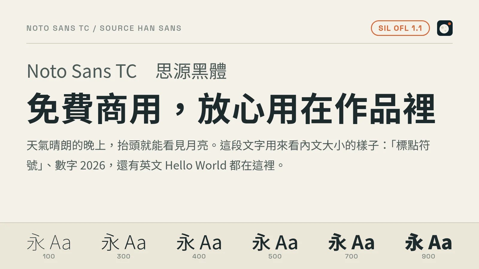
- License: SIL OFL 1.1
- Download: Google Fonts: Noto Sans TC, Google Fonts: Noto Sans SC, Adobe Source Han Sans on GitHub
Taipei Sans TC (台北黑體)
Taipei Sans TC is based on Source Han Sans, with glyphs adjusted for how people in Taiwan use them. The strokes are crisp, and it looks great in slide and poster titles.
- Traditional Chinese: its glyphs follow the Taiwan standard, so it's mainly a fit for Traditional Chinese.
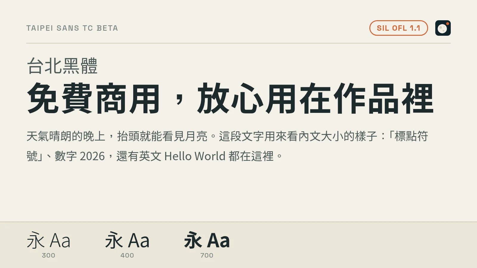
- License: SIL OFL 1.1, for personal and commercial use
- Download: JT Foundry official download page
Rounded: friendly, playful UI and social graphics
jf open Huninn (jf open 粉圓)
A rounded font open-sourced by the Taiwanese type company justfont. The shapes are soft and round with a strong Taiwanese feel. It works well for social media graphics, designs for kids, and game UI.
- Traditional Chinese: its glyphs follow the Taiwan standard, so it's mainly a fit for Traditional Chinese.
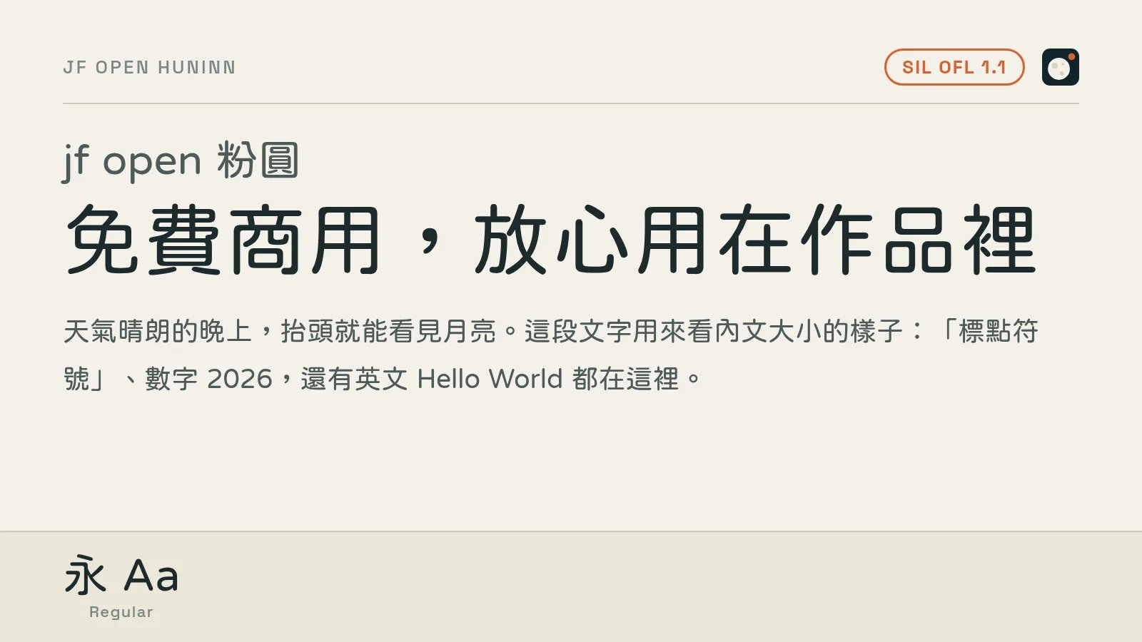
- License: SIL OFL 1.1
- Download: justfont/open-huninn-font on GitHub
GenSen Rounded (源泉圓體)
A rounded font based on Source Han Sans with all the corners rounded off. It has more weights than Huninn and looks more upright overall. It suits places that need "friendly, but not too cute," like the UI of a service website or app.
- Traditional Chinese: its glyphs follow the Taiwan standard, so it's mainly a fit for Traditional Chinese.
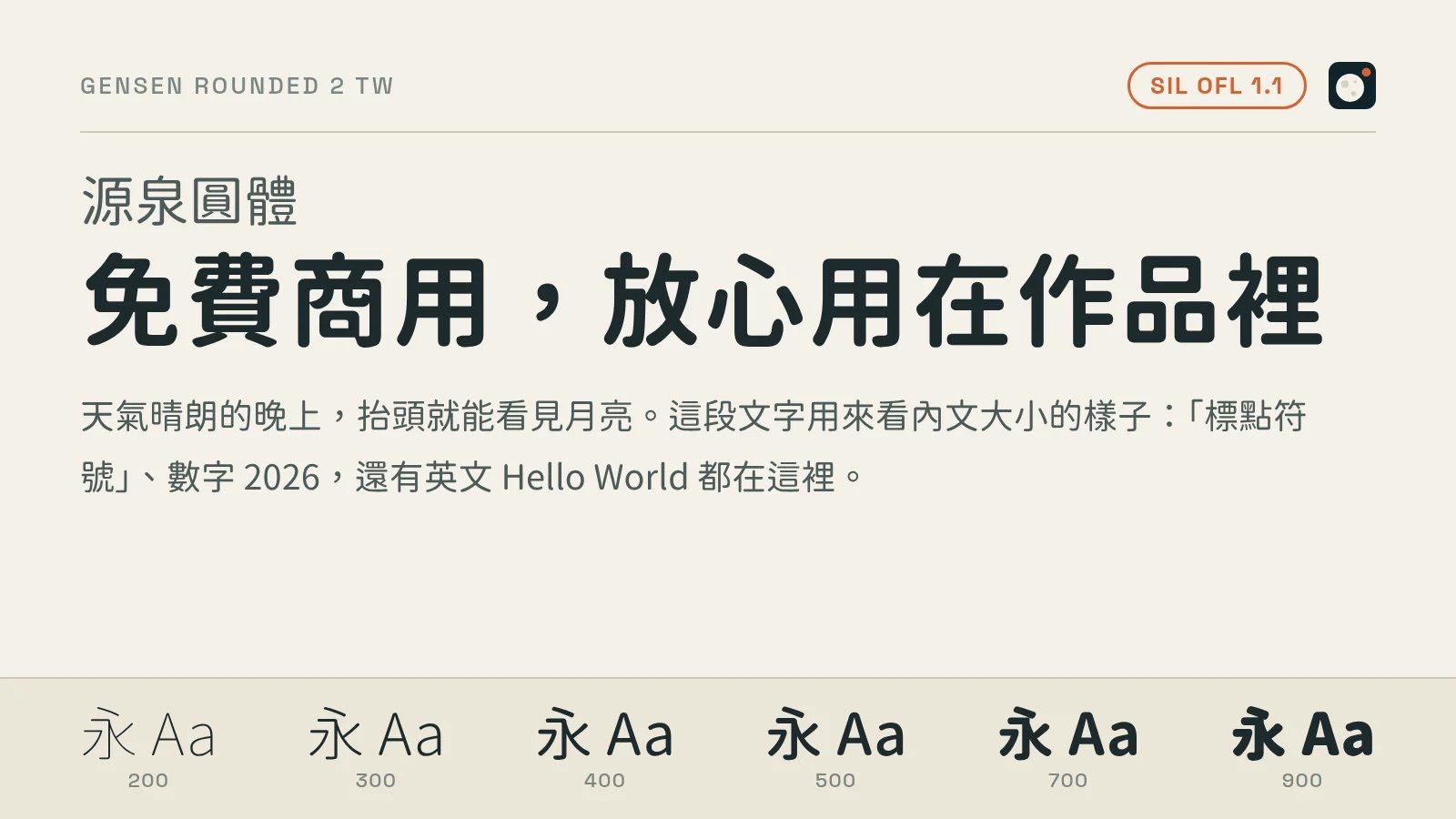
- License: SIL OFL 1.1
- Download: ButTaiwan/gensen-font on GitHub
Serif (Ming / Song): articles, books, and headings with character
Noto Serif TC / SC (Source Han Serif, 思源宋體)
The serif from the same family as Source Han Sans. Among free serif fonts for Traditional Chinese that allow commercial use, it has the most complete weights and coverage. It works well for long-form article titles, book covers, and designs with a literary touch.
- Traditional and Simplified: both are covered. Noto Serif TC is Traditional Chinese, Noto Serif SC is Simplified Chinese.
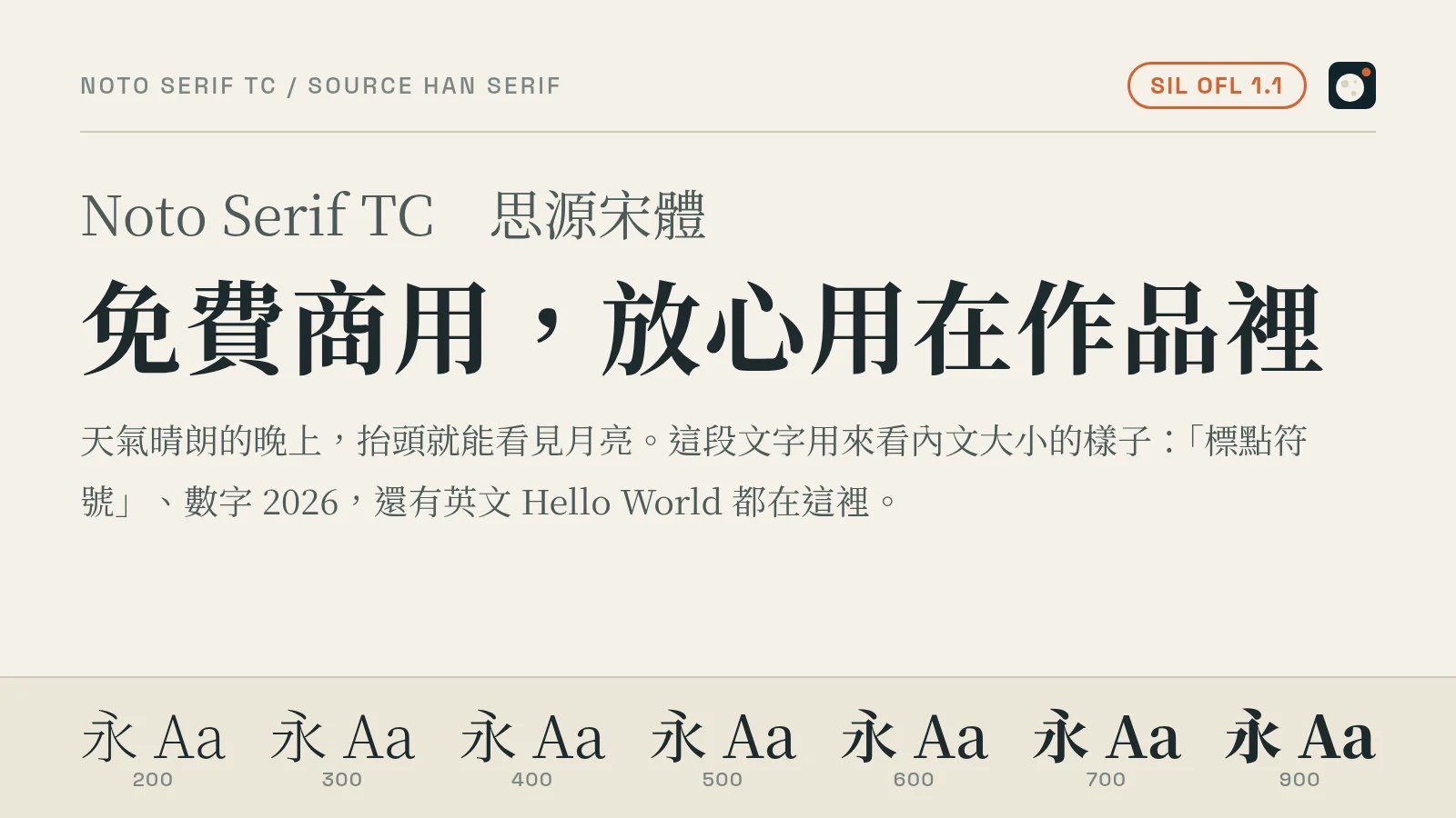
- License: SIL OFL 1.1
- Download: Google Fonts: Noto Serif TC, Google Fonts: Noto Serif SC, Adobe Source Han Serif on GitHub
GenWan Min (源雲明體)
A serif based on Source Han Serif, by the same author as GenSen Rounded. The strokes have more personality than Source Han Serif, and it looks especially good in headings.
- Traditional Chinese: its glyphs follow the Taiwan standard, so it's mainly a fit for Traditional Chinese.
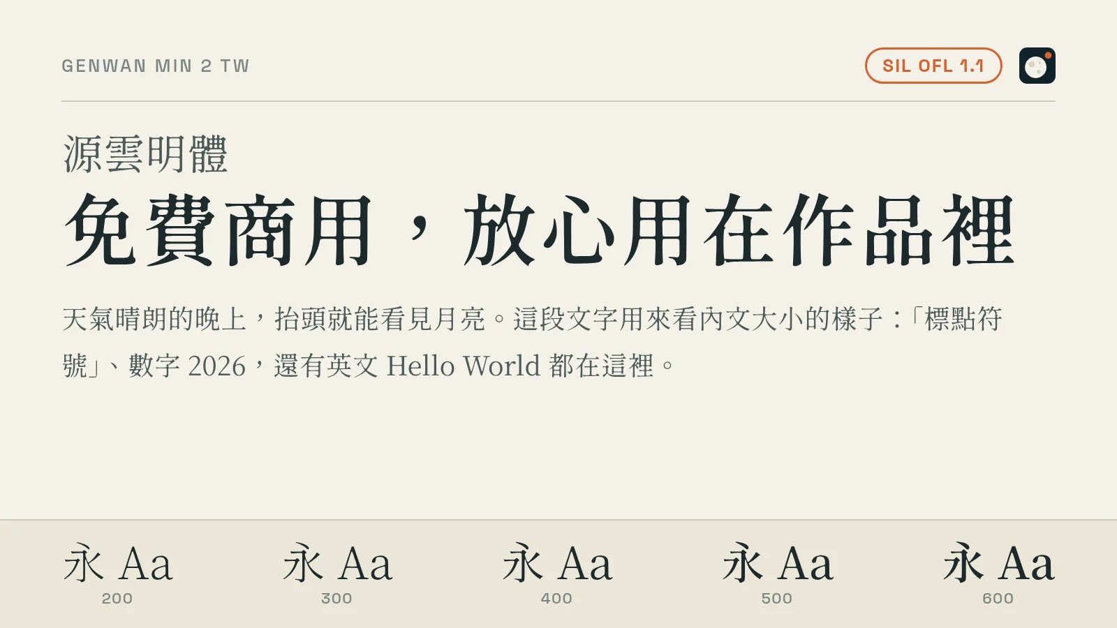
- License: SIL OFL 1.1
- Download: ButTaiwan/genwan-font on GitHub
Kai and handwriting: warmth and storytelling
LXGW WenKai (霞鶩文楷)
An open-source Kai (regular script) font that's become very popular in recent years. It sits between calligraphy and handwriting, and it's very comfortable to read. It's a good fit for body text in note-taking apps and reading sites, or for headings that need some warmth.
- Traditional and Simplified: the original LXGW WenKai is Simplified Chinese. For Traditional Chinese, use LXGW WenKai TC, whose glyphs follow the way characters are written in Taiwan.
One thing to watch: it merges some variant characters into a single glyph (for example, 真 and 眞). If your content needs to tell those characters apart, it's not the right font.
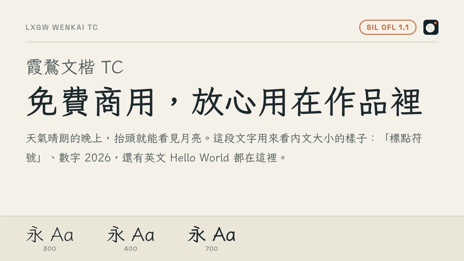
- License: SIL OFL 1.1
- Download: lxgw/LxgwWenKai on GitHub (Simplified), lxgw/LxgwWenkaiTC on GitHub (Traditional). It's also on Google Fonts.
Jason Handwriting (清松手寫體)
A Chinese handwriting font that looks like a real person wrote it with a ballpoint pen. It's great for handwritten-style social graphics, cards, and letters or diaries inside a game. The author says it plainly in the notes: any kind of commercial use is 100% free.
- Traditional Chinese: its glyphs follow the Taiwan standard, so it's mainly a fit for Traditional Chinese.
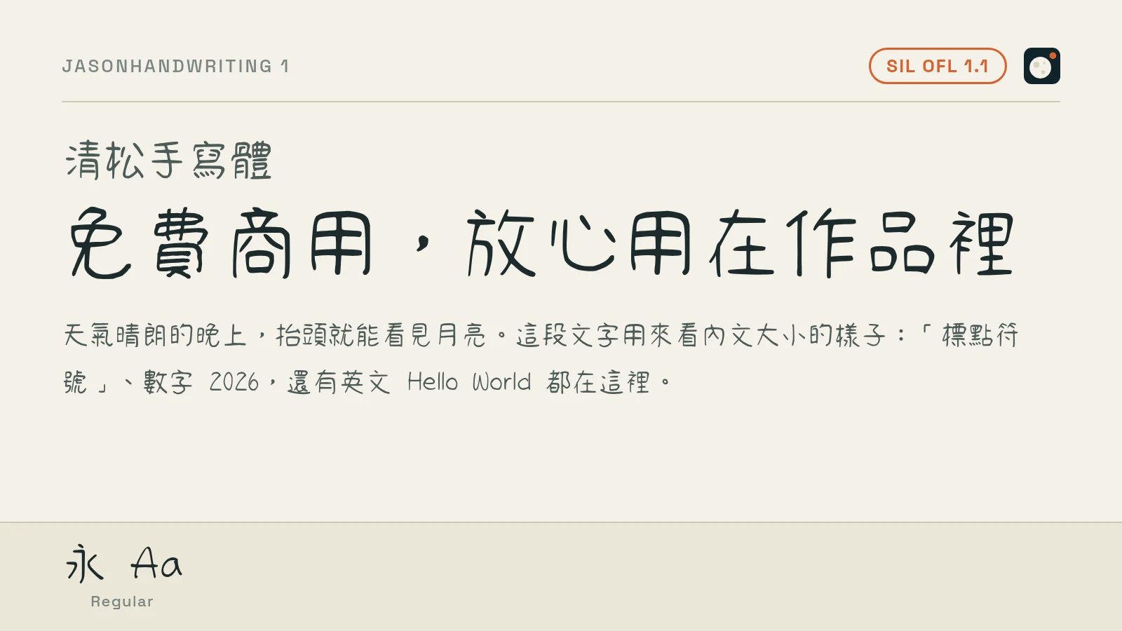
- License: SIL OFL 1.1
- Download: jasonhandwriting/JasonHandwriting on GitHub
Chenyu Luoyan (辰宇落雁體)
A handwriting font with a calligraphy feel. The strokes vary in thickness, which makes it a great fit for titles with an ancient Chinese, wuxia, or xianxia (fantasy) style.
- Traditional Chinese: its glyphs follow the Taiwan standard, so it's mainly a fit for Traditional Chinese.
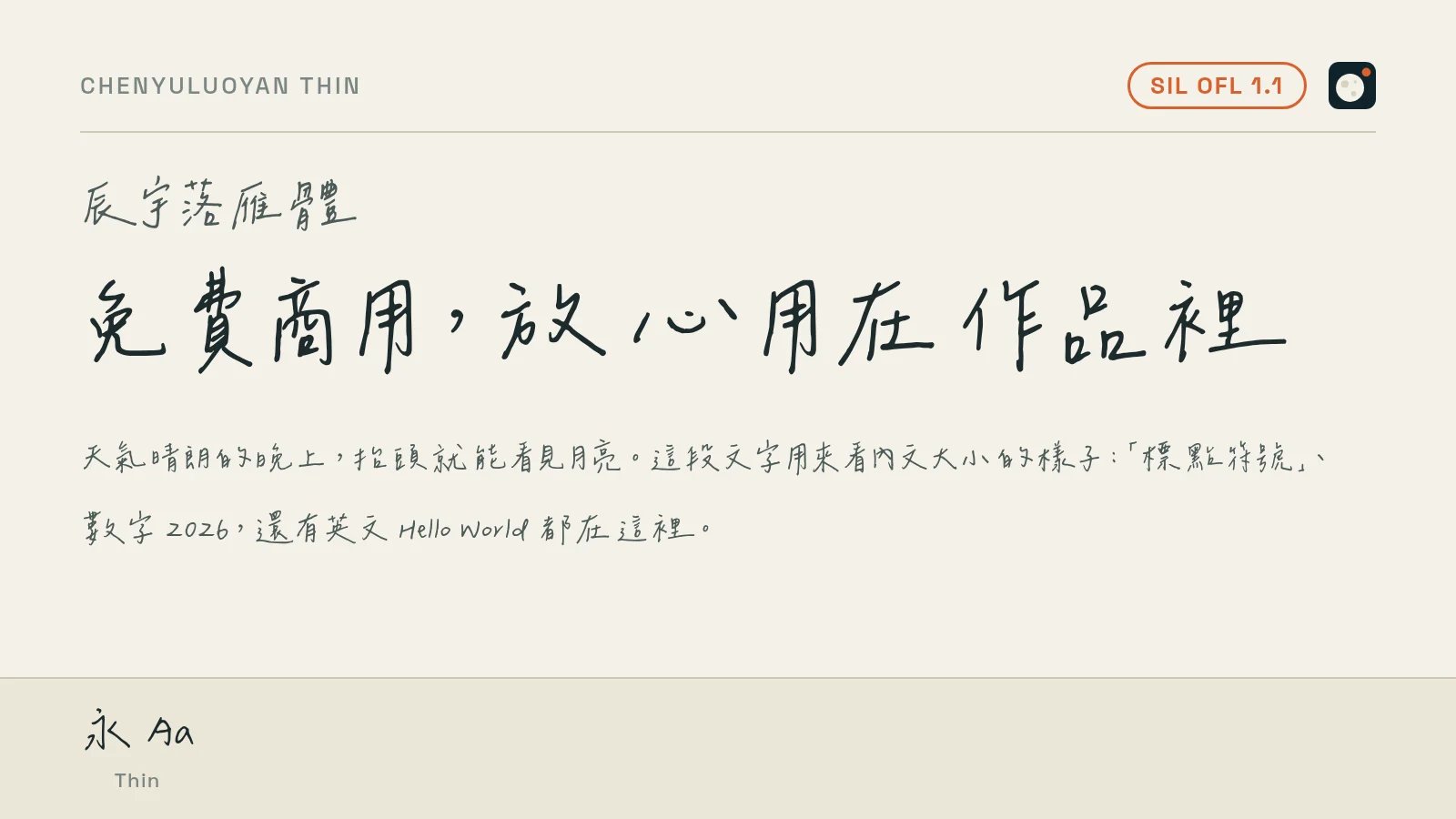
- License: SIL OFL 1.1
- Download: Chenyu-otf/chenyuluoyan_thin on GitHub
Latin fonts to pair with Chinese
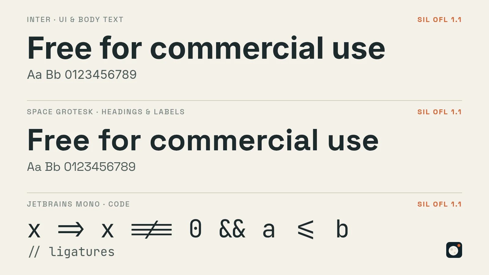
For the Latin text around your Chinese, the choice is much bigger: there are far more free Latin fonts for commercial use, and almost everything on Google Fonts allows it. These three are the ones I find most useful:
Font | Best for | License |
|---|---|---|
**Inter** | Website and app UI and body text; clear even at small sizes | SIL OFL 1.1 |
**Space Grotesk** | Headings and labels, with a slightly techy feel (this site's English labels use it) | SIL OFL 1.1 |
**JetBrains Mono** | Code and terminals, with ligatures | SIL OFL 1.1 |
Fonts released by Taiwan's government: different licenses
Taiwan's government has also released free fonts. They're Traditional Chinese, and their licenses aren't the OFL. The CNS11643 Zheng Song and Zheng Kai fonts (Ministry of Digital Affairs) let you choose either the Open Government Data License or SIL OFL 1.1, and both allow commercial use. If you pick the government license, you have to credit the source (Ministry of Digital Affairs, CNS11643 Chinese Standard Interchange Code website); pick the OFL and it works like the fonts above. Download them from the CNS11643 website. The Ministry of Education's standard Kai and Song fonts use CC BY-ND 3.0 TW: commercial use is allowed, but you must credit the "Ministry of Education, R.O.C.", and no derivatives are allowed. Subsetting, modifying, or merging with other fonts all count as derivatives, so they're not suited for webfonts that need subsetting.
Traditional or Simplified Chinese: which version do you need?
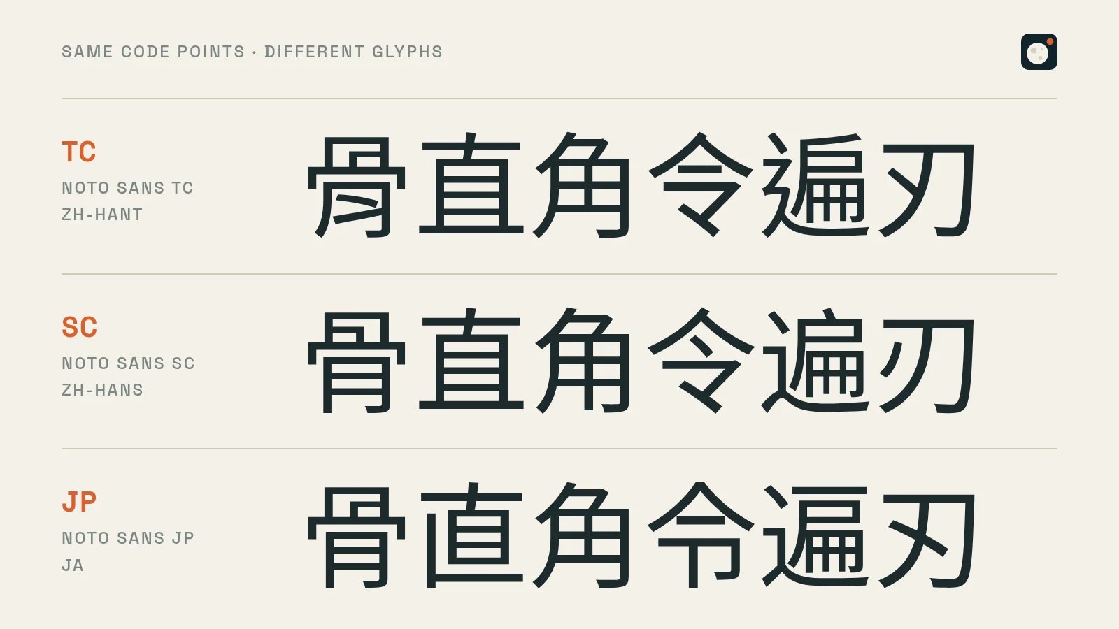
This is the part that matters most when you localize into Chinese. Taiwan and Hong Kong use Traditional Chinese (TC, zh-Hant). Mainland China and Singapore use Simplified Chinese (SC, zh-Hans). Japanese has its own glyph forms too (JP).
Even the same character is often written differently in Traditional Chinese, Simplified Chinese, and Japanese, for example the stroke details in 骨, 直, and 令. That's why the Source Han / Noto family comes in several versions: the code point is the same, but the glyph follows each region's standard. Pick the wrong version and native readers will notice right away that something looks off.
Traditional Chinese (Taiwan) | Simplified Chinese |
|---|---|
Noto Sans TC / Source Han Sans TC | Noto Sans SC / Source Han Sans SC |
Noto Serif TC / Source Han Serif TC | Noto Serif SC / Source Han Serif SC |
LXGW WenKai TC | LXGW WenKai (the original is Simplified) |
Taipei Sans TC, Huninn, GenSen Rounded, GenWan Min, Jason Handwriting, and Chenyu Luoyan, plus the Ministry of Education and CNS11643 fonts, all follow Taiwan's glyph forms. For a Simplified Chinese UI, I'd use the right-hand column of the table instead.
On the web, mark the language in your HTML (lang="zh-Hant", lang="zh-Hans") and set fonts per language, so the browser doesn't pick the wrong version.
Making a Chinese version of a website, app, or game: font gotchas
A Latin font only has to handle a few hundred characters. A Chinese font easily has tens of thousands, so a Chinese version runs into problems that English never does:
- The files are huge: one weight of a Chinese font is several MB, and all the weights together can be over 100 MB. You can't load the whole thing on a web page, and it bloats app and game installers too.
- On the web, Google Fonts is the easiest option: Google slices the font into many small pieces by unicode-range, and a page only downloads the pieces for the characters it uses. That's how my blog loads Noto.
- Self-hosting or bundling into a game? Subset the font: use a tool like
pyftsubset(fonttools) to keep only the characters your text actually uses. But anywhere you can't predict the content, like player names or chat, keep a full font as a fallback. - Subsetting counts as modifying: under the OFL, a subset font is a modified version. If the author has Reserved Font Names (like "Source" in the Source Han family), you can't keep the original name when you redistribute the subset. Noto has no reserved names, so it's much simpler. LXGW WenKai does have a reserved name, but the author states separately that subsetting or converting to WOFF2 just for webfonts can keep the original name. The Ministry of Education fonts can't be subset at all.
- Handwriting fonts usually have only one weight: fonts like Jason Handwriting and Chenyu Luoyan have no bold, and faux bold makes the strokes blur together. To emphasize a heading, use size, not bold.
- Chinese has no italics: English UIs often use italics for emphasis. In the Chinese version, switch to bold or a different color, or the browser will slant the characters artificially, and it looks bad.
These fonts are not free for commercial use
Finally, a few common misunderstandings:
- A font that ships with your computer isn't automatically free for commercial use. System fonts like Microsoft JhengHei (微軟正黑體) and Microsoft YaHei (微軟雅黑) on Windows, or PingFang (蘋方) on Mac, are licensed for use on that computer. Using them in a logo, printing them on products, or distributing them as webfonts is outside that license.
- Commercial type foundries like DynaComware (華康), Arphic (文鼎), Founder (方正), and Hanyi (漢儀): even if a font came with Office or some website offers it for download, commercial use needs a separately purchased license.
- Be careful with "free font download" sites. Many mix paid fonts and "personal use only" fonts in with everything else. Always go by the original author's official page or GitHub for the license.
- For modified fonts, check the original license. Taipei Sans TC, GenSen Rounded, and GenWan Min are all derived from the Source Han family. Because the original is OFL, the derivatives must be OFL too, so you can use them with confidence. The other way around: if you modify these fonts yourself and release them, you can't keep the author's Reserved Font Names, such as "Source" for the Source Han family, "huninn" for Huninn, or "辰宇落雁" for Chenyu Luoyan.
How to choose: fonts by use case
Use | Recommended | Traditional / Simplified |
|---|---|---|
Website and app body text | Noto Sans TC / SC (Source Han Sans), Inter | Both |
Article titles, book covers | Noto Serif TC / SC (Source Han Serif), GenWan Min | Both (GenWan Min: Traditional) |
Slide and poster titles | Taipei Sans TC | Traditional |
Social graphics, cute UI | jf open Huninn, GenSen Rounded | Traditional |
Reading, notes | LXGW WenKai | Both (Simplified original, TC version) |
Handwritten feel, cards, in-game documents | Jason Handwriting | Traditional |
Ancient-style and wuxia titles | Chenyu Luoyan | Traditional |
Code | JetBrains Mono | Latin only |
Wrapping up
When you're looking for free Chinese fonts for commercial use, the key question isn't "where can I download it?" but "where is the license?" Once you can recognize the OFL and know to check the original author's page, you can use these fonts in your websites, games, and products without worry. And pick TC or SC to match your readers.
Which free font do you use most? Any good fonts for commercial use I missed? Come find my post on Threads or X and leave a comment there.